Enaml-native is like Enaml, but it uses native Android or iOS components instead of Qt components as building blocks. So to understand the basic structure of an enaml-native app, you need to understand some of the basic Enaml concepts, like declarative components and data binding operators. If you already know Enaml, there's a few enaml-native specifics but feel free to skip ahead.
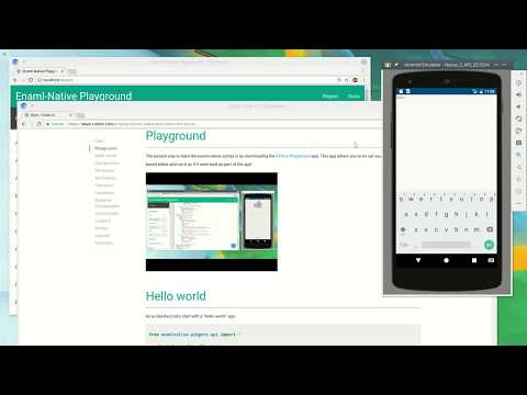
The easiest way to try out enaml-native is by downloading the Python Playground app. This app is free and allows you to enter code into a web based editor and run it as if it were built as part of the app!
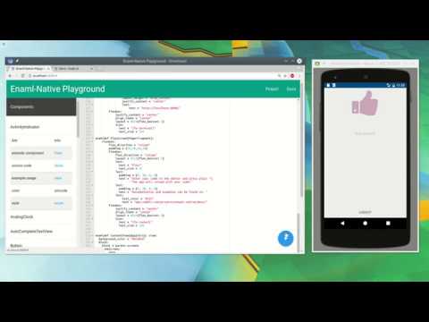
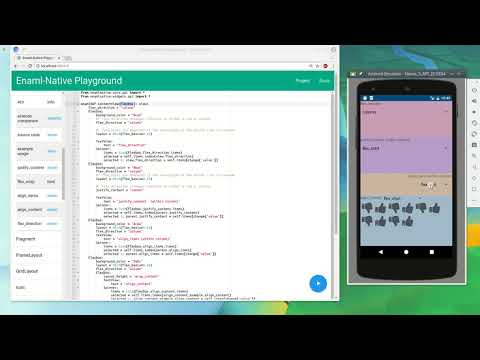
Heres's a short video tutorial on the enaml syntax and core api nodes to help get you started.
Enaml Syntax
Enaml Pattern Nodes
More on the way!
As is standard, let's start with a "Hello world" app.
from enamlnative.widgets.api import *

enamldef ContentView(Flexbox):
    TextView:
        text = "Hello world!"
This doesn't look like python? We're using enaml to define a view within our app. Enaml is a subset of the python language that provides a very powerful way of building UI's.
If you're unfamiliar with enaml read the enaml introduction to get an idea of what it is and why it's used. Once done read about the enaml syntax. Enaml is at the core of enaml-native.
First, all the enaml-native components are imported using a standard python import statement. Next the enamldef keyword is used to define a new component named ContentView that extends the LinearLayout component. The enamldef keyword has similarities to the class keyword in python. After that we add a TextView to our layout and assign the "Hello world!" expression to the text attribute of the view. In enaml, everything on the right hand side is evaluated lazily within the context of the view state at runtime. This lets you reference other components and their state.
With enaml-native new components are created often. Everything you see on the screen is some sort of component. Components can be simple or complex but, like a python class, must have at least one body statement (which can just be the pass keyword).
A component is defined by extending an existing component and specifying any attributes or children the new component needs. Above the ContentView is a new component extends the LinearLayout component and includes a TextView child. Components are commonly used to encapsulate several views with a desired layout and the attributes required to populate the view. Doing this makes parts of your app easier to reuse and makes your code easier to read much like classes do in object-oriented programming.
Many builtin components are simply wrappers around native widgets that expose their functionality as attributes. If you're familiar with Android or iOS, the LinearLayout (or UIStackView) is a widget that lays out it's children in either a single row or column. When we use this component it's creating the native widget and any required properties or adapters for us. It's possible to define your own components to wrap any special native widgets you may have, see the more advanced documentation for that.
Components can be customized by setting attributes. These are like python class attributes but they use the atom framework and are often type restricted. Attributes are set to customize the underlying native widget so it is created and updated as desired. For example the text of a button or the checked state of a switch.
Attempting to set an attribute that has not been defined by the component will throw an error. Often times you need to hold extra state within the component. You can define custom attributes using the attr keyword.
from enamlnative.widgets.api import *
from atom.api import Str

enamldef ContentView(Flexbox):
    #: A new attribute with a default of 0
    attr count = 0

    #: A new attribute that is restricted to a given type
    attr title: Str

    #: A new attribute that is restricted to a given type with a default
    attr caption: Str = "A caption"
These custom attributes can then be used like any other enaml attribute.
Components often need to reference other components for interactions or to update their state accordingly. References are made by adding a <name>: after the component. Once defined, references can be used to access the attributes of a component.
from enamlnative.widgets.api import *

enamldef ContentView(Flexbox):
    #: Define a reference variable of `echo_me`
    TextView: echo_me:
      text = "Hello"

    TextView:
      #: Use the reference `echo_me`
      text = echo_me.text
The example is pretty useless, but you get the idea. There's also a few other useful reference scope variables: self, parent and children. Self is just like the self of a class, it's a reference to the current component. Parent, as the name implies, is a reference to the parent component of the current component (or None for the root component). Children, is a list that contains a reference to all children components of the current component.
from enamlnative.widgets.api import *

#: Define a component with the reference "view"
enamldef ContentView(Flexbox): view:
    flex_direction = "column"
    attr text = "Hello!"

    #: Self reference example
    Button:
      text = "add"
      clicked ::
        #: Will print out "Button add clicked" when clicked
        print("Button {} clicked".format(self.text))

    #: Parent reference example
    TextView:
      #: Use the reference `parent` to set the text to the `text` attribute
      #: Note: If a reference is not used in this case we would get a recursive loop!
      text << parent.text

    #: Children reference example
    TextView:
      #: Use the reference `children` to print out the repr string of each
      #: direct child of the ContentView
      text = ",".join([str(c) for c in parent.children])
References are used very often within enaml-native apps. The scope of each reference depends on where the component is but generally they're all availble for use (with some exceptions) within the entire enamldef block. References of one component cannot be accessed outside of that components declaration (unless an alias keyword is used) but that will be covered later (look in the enaml docs for the examples).
By default any references defined within a component are "private" and cannot be accessed outside of the component. Sometimes you may need to make an internal component or specific attribute of a component availble to be updated outside via an attribute. An alias allows you do to this.
from enamlnative.core.api import Block, Looper
from enamlnative.widgets.api import *
enamldef SettingsItem(Flexbox):
height = "wrap_content"
background_color = "#fff"
padding = (10,10,10,10)
margin = (0,10,0,10)
enamldef BoringSettingsItem(SettingsItem):
attr title
attr content
Flexbox:
flex_direction = "column"
TextView:
text << title
TextView:
text << content
enamldef FancySettingsItem(SettingsItem):
#: Alias to a component
#: allows access to any attribute
alias title
alias content
#: Alias to a single attribute of a component
alias direction: flex.flex_direction
Flexbox: flex:
flex_direction = "column"
justify_content = "space_between"
align_items = "center"
TextView: title:
pass
TextView: content:
pass
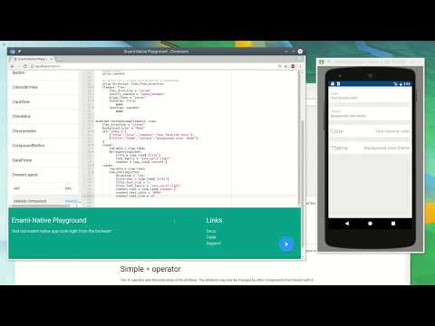
enamldef ContentView(Flexbox): view:
flex_direction = "column"
background_color = "#eee"
attr items = [
{"title":"Color","content":"Your favorite color"},
{"title":"Theme","content":"Background color theme"},
]
Looper:
iterable = view.items
BoringSettingsItem:
title = loop_item['title']
content = loop_item['content']
Looper:
iterable = view.items
FancySettingsItem:
direction = "row"
title.text = loop_item['title']
title.text_size = 24
title.font_family = "sans-serif-light"
content.text = loop_item['content']
content.text_color = "#999"
Aliases are commonly used with Block pattern nodes (see below). They allow your components to be more customizable at the expense of slightly more verbose declarations.
One of the most powerful features of enaml is it's data binding operators. Enaml's data binding operators are what makes enaml much nicer than working with react or react-native in many cases. The operators are >>, <<, :=, :: and =.
The = operator sets the inital state of the attribute. The attribute may later be changed by other components that interact with it.
The << operator a one way binding from a model to the UI component. This allows your UI to automatically update whenever a change occurs in your model and it automatically binds to changes in any atom objects used in the python expression.
from enamlnative.widgets.api import *

enamldef ContentView(Flexbox):
    Switch: sw:
      checked = False

    TextView: tv:
      #: Use subscribe operator to update the label whenever the switch changes
      text << "Checked {}".format(sw.checked)
In the above example, whenever the user toggles the switch, the text updates to display the switches checked state. Enaml will see that sw.checked is an observable attribute and will update whenever it's changed. It can observe any number of attributes on the RHS, even those returned from functions, and will update when any of the observed attributes change!
The >> operator is a one way binding that notifies the component when the UI component updates the attribute. This allows your UI changes to then be properly handled (ex, updating your model).
from enamlnative.widgets.api import *

enamldef ContentView(Flexbox):
    Switch: sw1:
      checked = False
      checked >> sw2.checked
    Switch: sw2:
      checked = False
In this example, when switch sw1 is toggled, switch sw2 will also be set to the same state. However if switch sw2 is toggled, switch sw1 will not change.
The := operator does a two way binding between the UI component and a model (or another components's) attribute. This allows you to easily keep two attributes in sync (ex, UI attribute and model attribute or two UI attributes).
from enamlnative.widgets.api import *

enamldef ContentView(Flexbox):
    Switch: sw1:
      checked := sw2.checked
    Switch: sw2:
      checked = True
In this example, toggling either switch will cause the other to toggle as well. Both switches will always stay in sync even though only one is being applied. Generally this operator will be used to bind to an attribute of a data model as shown below.
from atom.api import Atom, Bool
from enamlnative.widgets.api import *

class Model(Atom):
  enabled = Bool()

enamldef ContentView(Flexbox):
    attr model = Model()
    Switch:
      checked := model.enabled
In the above example our model's enabled state will be bound to the switch checked state. If either are changed they will both stay in sync.
The :: operator notifies the component when an event occurs, such as a button click, and allows you to handle the event as needed.
from enamlnative.widgets.api import *

enamldef ContentView(Flexbox):
    flex_direction = "column"
    Button:
      text = "Click me"
      clicked ::
          #: This block of code will execute when clicked
          print("Button was clicked!")
Above we see the notify operator triggers the event handler directly within the component. Any python code (except for yield and return statments can be used within the handler block.
In some cases you might want to know what the previous value was before the change occured. You can use the change scope variable to see and react accordingly.
from enamlnative.widgets.api import *

enamldef ContentView(Flexbox):
    flex_direction = "column"
    EditText: et:
      text ::
            #: When text changes
            try:
                #: If an integer was typed, update the text
                if int(change['value']):
                    tv.text = change['value']
            except ValueError:
                pass
    TextView: tv:
      pass
The above example with update the TextView's text attribute if the user enters an integer into the EditText's input field. Using this operator, along with the << operator is very useful for doing things like to and from conversion of a value based on a unit input.
The change variable is a dictionary containing useful change information such as the current value change["value"], the name that changed change["name"], the type of change change["type"], the the previous value change["oldvalue"], and the object that was changed change["object"].
Note: Certain events may contain additional data that may be needed to decide how the event should be handled. When a key is pressed, or an action selected, it may be important to know which key. Event data is passed into your handler block via the
changescope variable. The change dictionary keys depend on the type of event that occurred.
There's a good talk by the developer of enaml on youtube where he describes the operators in more detail.
If you're familiar with react or react-native programming, these operators eliminate the need for setState, the "flux" pattern, and other state containers such as Redux. Enaml and Atom handle all of the state and changes for you.
If you're familiar with Android or iOS programming, this entirely eliminates the need to add listeners, callback functions, or use key value observers. Enaml and the native toolkit implementation(s) handles all of this seamlessly behind the scenes. See the more advanced documentation or the code for more details if you're interested.
In order to better keep your component reusable you can define functions within your component that have access to the scope of the component. These are done using the func keyword and define just like a python's def.
Note: You can still use python functions within your handlers and observers you'll just have to pass in any scope variables manually! Also you cannot define normal
deffunctions within handlers, onlylambdais allowed (and you must copy the scope variables needed!).
from enamlnative.core.api import *
from enamlnative.widgets.api import *


def on_click_noscope(btn,tv):
    #: Have to pass in scope!
    btn.count +=1
    tv.text = "Clicked count {}!".format(btn.count)

enamldef ContentView(Flexbox):
    flex_direction = "column"

    func on_click():
        #: We can access scope here without passing refs!
        btn.count +=1
        tv.text = "Clicked count {}!".format(btn.count)

    TextView: tv:
        text = "Text"

    Button: btn:
        attr count = 0
        text = "func"
        clicked :: on_click()

    Button:
        text = "def"
        clicked :: on_click_noscope(btn,tv)
So using a func allows you to write cleaner code without needing to pass references around. This is very useful when adding callbacks when an async result is complete (ex an http request).
Since components are like classes, you can also override a functions but there's a differnt syntax.
from enamlnative.core.api import *
from enamlnative.widgets.api import *

enamldef IncButton(Button):
    text = "+"

    #: Define function
    func update_count(ref):
        ref.count +=1

enamldef DecButton(IncButton):
    text = "-"

    #: Override function
    update_count => (ref):
        ref.count -=1

enamldef ContentView(Flexbox):
    flex_direction = "column"
    TextView: tv:
        attr count = 0
        text << "Count {}".format(self.count)
    IncButton:
        clicked :: update_count(tv)
    DecButton:
        clicked :: update_count(tv)
The example is pretty useless but you get the concept. Override using <func name> => (args..) and then the new definition.
Often time's you'll want to be display a component only when a certain condition is met. Additionally it's common to have to repeat a component based on a list of items. Enaml has an extremely powerful dynamic component system that allows you to do this and more.
The Conditional node does not have any display widget, but instead uses it's condition attribute to decide if it's children should be rendered or not.
from enaml.core.api import Conditional
from enamlnative.widgets.api import *

enamldef ContentView(Flexbox):
    flex_direction = "column"
    Switch: sw:
        text = "Toggle condition"
        checked = False
    Conditional:
        condition << sw.checked
        #: This will only be shown if the switch is turned on!
        TextView:
            text = "Show me!"
In the above example the TextView will be shown or hidden based on the checked state or the switch. The Condtional inserts into or removes it's children from the parent component based on the condition attribute. This is very efficient as only the components within the Condtional block need to be rerendered.
Note: The condition must be a boolean. If you're simply checking for exitance use
is not Noneor wrap the expression in abool(expr)call.
The Looper node also does not have any display widget, but instead uses it's iterable attribute to to generate a component for each item within the iterable list.
from enaml.core.api import Looper
from enamlnative.widgets.api import *

enamldef ContentView(Flexbox): view:
    flex_direction = "column"
    attr items = ["one", "two", "three"]
    Looper:
        iterable << view.items
        #: This node is repeated for each item and given
        #: the additional scope variables `loop_index` and `loop_item`
        TextView:
            text = "{}. {}".format(loop_index+1, loop_item)
In the above example three TextView components will be added to the ContentView the text being "1. one", "2. two", and "3. three" for each component respectively. Items within the loop arg given new variables loop_item and loop_index which are self explanitory. Enaml's Looper is also very efficient in that it will only create or destroy child components that have been changed and reuses those that have not.
Note: If you happen to need to loop over two or more lists you can use
attrkeywords to save references to the parent loop's item as needed.
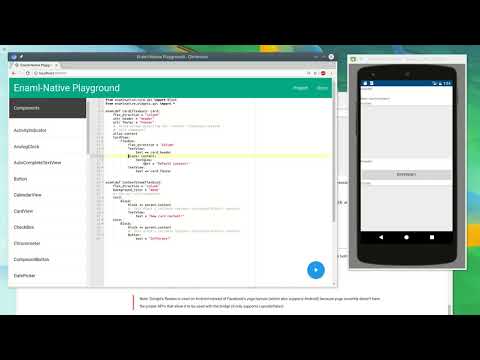
The Block node is a component specific to enaml-native. It's useful if you want to be able to define default content of a component but then later be able to override it in a subcomponent if needed.
from enamlnative.core.api import Block
from enamlnative.widgets.api import *

enamldef Card(Flexbox): card:
    flex_direction = "column"
    attr header = "Header"
    attr footer = "Footer"
    #: Alias allows accessing the `content` reference outside
    #: this component
    alias content
    CardView:
        Flexbox:
            flex_direction = "column"
            TextView:
                text << card.header
            Block: content:
                TextView:
                    text = "Default content!"
            TextView:
                text << card.footer


enamldef ContentView(Flexbox):
    flex_direction = "column"
    background_color = "#eee"
    #: Use our card component
    Card:
        Block:
            block << parent.content
            #: This block's children replace referenced block's content!
            TextView:
                text = "New card content!"
    Card:
        Block:
            block << parent.content
            #: This block's children replace referenced block's content!
            Button:
                text = "Different!"
The block makes it easy to define "template" like components where you can easily override certain parts, maximizing code reusability. If you're familiar with templating languages like django's templates this is a similar concept.
Note: It's important to notice here that a Block without a
blockattribute set is a placeholder and a Block with theblockattribute set overrides the placeholder's content.
There are several platform dependent layouts that can be used, however it's recommended to use Flexbox which supports both Android and iOS and is much more "flexible" (no pun intended).
If you're unfamiliar with flexbox, there great examples all over the web so just search.
enaml-native uses Google's flexbox-layout for Android and Facebook's yogakit for iOS.
Note: Google's flexbox is used on Android instead of Facebook's yoga layouts (which also supports Android) because yoga currently doesn't have the proper API's that allow it to be used with the bridge (it only supports LayoutInflater).
Use the flex_direction attribute to layout children in a row or column. Use justify_content to arrange the children along the same row or column axis. Use align_items to arrange children within the opposite axis of the flex_direction. Use align_content to align children that have wrapped (when flex_wrap='wrap' in groups. See the Flexbox component in the Playground's component list to see the appropriate values for each.
from enamlnative.core.api import *
from enamlnative.widgets.api import *

enamldef ContentView(Flexbox): view:
    flex_direction = "column"
    Flexbox:
        background_color = "#cab"
        #: Flex direction arranges children in either a row or column
        flex_direction = "column"

        #: flex_basis (on Android) is the percentage of the parent size to consume
        flex_basis=0.25

        TextView:
            text = "flex_direction"
        Spinner:
            items = list(Flexbox.flex_direction.items)
            selected = self.items.index(view.flex_direction)
            selected :: view.flex_direction = self.items[change['value']]
    Flexbox:
        background_color = "#bac"
        flex_direction = "column"
        #: flex_basis (on Android) is the percentage of the parent size to consume
        flex_basis=0.25

        #: Flex direction arranges children in either a row or column
        justify_content = "center"

        TextView:
            text = "justify_content  (within column)"
        Spinner:
            items = list(Flexbox.justify_content.items)
            selected = self.items.index(parent.justify_content)
            selected :: parent.justify_content = self.items[change['value']]
    Flexbox:
        background_color = "#cba"
        flex_basis=0.15
        flex_direction = "column"
        TextView:
            text = "align_items (within column)"
        Spinner:
            items = list(Flexbox.align_items.items)
            selected = self.items.index(parent.align_items)
            selected :: parent.align_items = self.items[change['value']]
    Flexbox:
        background_color = "#abc"
        flex_basis=0.35
        flex_direction = "column"
        Flexbox:
            height = "wrap_content"
            TextView:
                text = "align_content"
            Spinner:
                items = list(Flexbox.align_content.items)
                selected = self.items.index(align_content_example.align_content)
                selected :: align_content_example.align_content = self.items[change['value']]
        Flexbox: align_content_example:
            flex_wrap = "wrap"
            Looper:
                iterable << range(10)
                Icon:
                    padding = (5,5,5,5)
                    text << "{fa-thumbs-up}" if loop_index & 1 else "{fa-thumbs-down}"
                    text_size = 48
You can also apply child specific layout parameters: align_self, flex_basis, flex_grow, flex_shrink.
Margin and padding can be set directly as the margin and padding attributes.
They should be tuples of the format (left,top,right,bottom).
More to come on layouts, stay tuned!
That's the basics of enaml and enaml-native. With knowledge of all of these, you should be ready to start building your own apps! If you have any questions create an issue or use post a question on stackoverflow to request help!