Picker
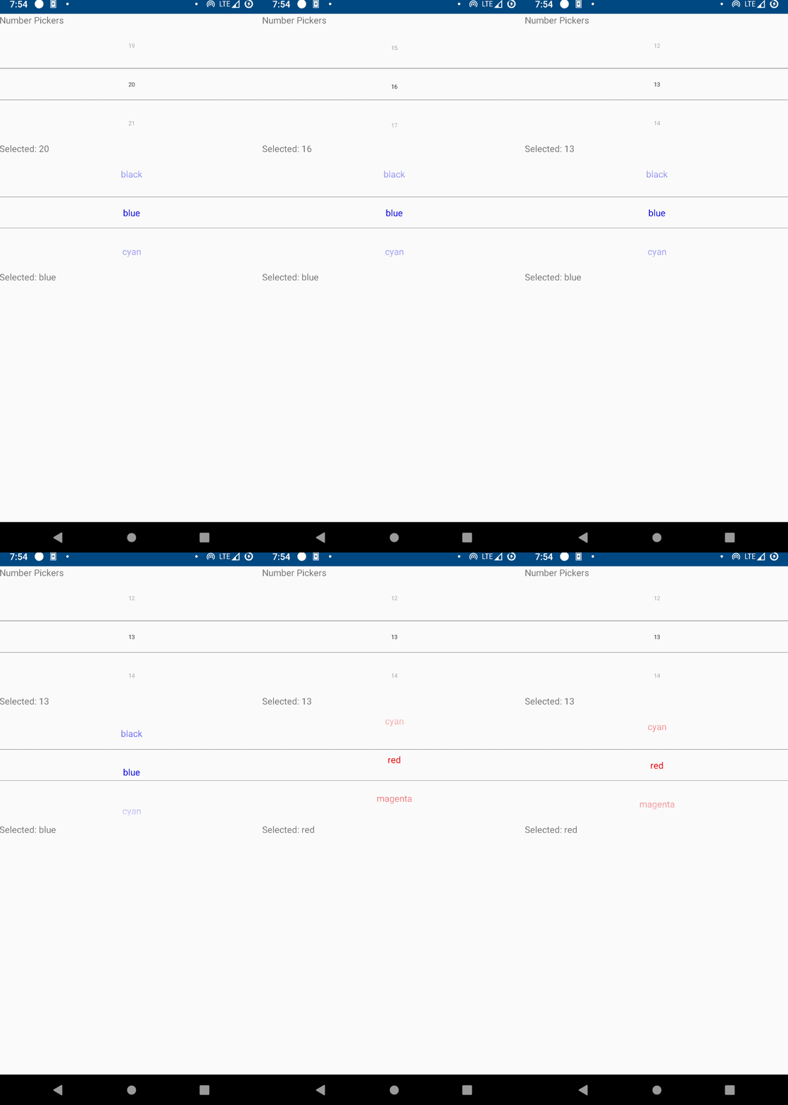
Screenshot

Example
from enamlnative.widgets.api import *

enamldef ContentView(Flexbox):
    flex_direction = "column"
    align_items = "stretch"
    TextView:
        text = "Number Pickers"

    #: Numeric by default (on android)
    Picker: pk1:
        min_value = 0
        max_value = 100
        value = 20
        text_size = 24
        divider_height = 2
    TextView:
        text << f"Selected: {pk1.value}"

    #: Use items for strings
    Picker: pk2:
        text_color << items[value]
        min_height = 100
        min_width = 100
        items = ["blue", 'cyan', 'red', 'magenta', 'green', 'yellow', 'black']
    TextView:
        text << f"Selected: {pk2.items[pk2.value]}"
Declaration
- class enamlnative.widgets.picker.Picker(parent=None, **kwargs)[source]
Bases:
enamlnative.widgets.linear_layout.LinearLayoutA simple control for displaying a Picker.
- max_value
Sets the max value of the picker
- min_value
Sets the min value of the picker.
- value
Set the current value or selected index for the picker.
- items
Items to display
- text_color
Text color
- text_size
Text size
- divider_height
Divider height
- long_press_update_interval
Sets the speed at which the numbers be incremented and decremented when the up and down buttons are long pressed respectively.
- wraps
Sets whether the selector wheel shown during flinging/scrolling should wrap around
- proxy
A reference to the proxy object.
Android Implementation
- class enamlnative.android.android_picker.AndroidPicker[source]
Bases:
enamlnative.android.android_linear_layout.AndroidLinearLayout,enamlnative.widgets.picker.ProxyPickerAn Android implementation of an Enaml ProxyPicker.
- widget
A reference to the widget created by the proxy.
No iOS implementation found.
