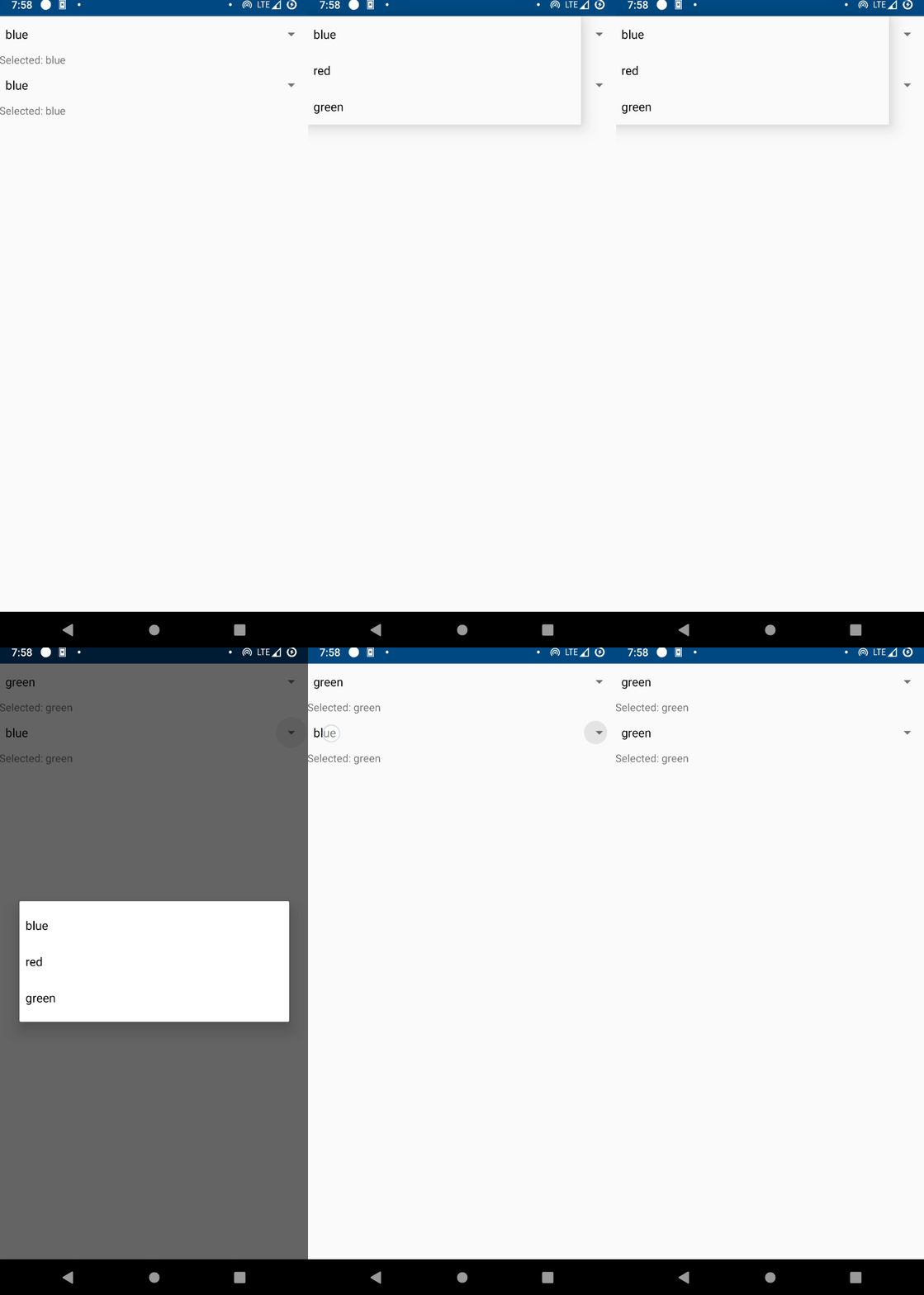
Spinner
Screenshot

Example
from enamlnative.widgets.api import *

enamldef ContentView(Flexbox):
    flex_direction = "column"
    align_items = "stretch"
    Spinner: sp:
        items = ["blue", 'red', 'green']
        selected = 0
    TextView:
        text << f"Selected: {sp.items[sp.selected]}"

    Spinner: popup:
        mode = "dialog"
        items = ["blue", 'red', 'green']
    TextView:
        text << f"Selected: {popup.items[sp.selected]}"
Declaration
- class enamlnative.widgets.spinner.Spinner(parent=None, **kwargs)[source]
Bases:
enamlnative.widgets.view_group.ViewGroupA simple control for displaying read-only text.
- mode
Set the mode
- prompt
Sets the prompt to display when the dialog is shown.
- selected
Should the layout be a column or a row.
- items
View gravity
- item_gravity
Gravity setting for positioning the currently selected item.
- drop_down_horizontal_offset
Set a horizontal offset in pixels for the spinner’s popup window of choices.
- drop_down_vertical_offset
Set a vertical offset in pixels for the spinner’s popup window of choices.
- drop_down_width
Set the width of the spinner’s popup window of choices in pixels.
- proxy
A reference to the ProxyLabel object.
Android Implementation
- class enamlnative.android.android_spinner.AndroidSpinner[source]
Bases:
enamlnative.android.android_adapter.AndroidAdapterView,enamlnative.widgets.spinner.ProxySpinnerAn Android implementation of an Enaml ProxySpinner.
- widget
A reference to the widget created by the proxy.
- adapter
Reference to adapter
- default_layout
Wrap content by default
- get_declared_items()[source]
Get the members that were set in the enamldef block for this Declaration. Layout keys are grouped together until the end so as to avoid triggering multiple updates.
- Returns
result – List of keys and values
- Return type
List of (k,v) pairs that were defined for this widget in enaml
No iOS implementation found.
